Earlier in a post I wrote how I found a great PBS documentary on the Pan-Am Expo however it was
finally located a VHS player, which was much more difficult than I originally thought (It take a long time to hook up all those cables from an old VCR to a new HD tv)! I eventually hooked everything up and the documentary was
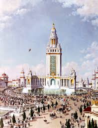
fantastic to watch. It not only gave a history of the event, but gave such great information about the 1901 Expo that you realize although the fair was temporary, nobody skimped on the details. The architecture is beautiful in the pictures and drawings, however often the color scheme of the Expo gets overlooked.
available only on VHS. I
The Director of Color, Charles Yardley Turner, specifically chose the color scheme of the Expo to reflect the story of progress (
The Pan-American Experience). By this time, there had been fairs in other American societies such as Atlanta and Chicago. The Pan-American Exposition Company felt that the Neoclassical design and architecture of the previous fairs were unremarkable already. They chose a different architectural style for Buffalo--- Spanish Renaissance. The color scheme accompanying this was also in opposition to the stark white classic colors of Neoclassicism. For the Buffalo Expo, designers wanted a cohesive story of progress. The red colored roofs atop the fair's buildings paralleled the red mud color Native American Indians used to paint their faces. It symbolized the "early state of man" in America. As visitors moved farther down the fair's mall, greens, grays and pale yellows began to emerge amongst the buildings, to symbolize refinement. The culmination of the color scheme concluded at the pièce de résistance-- The Electric Tower featured in a bright, stunning white color. This symbolized illumination, technology and innovation; the main attraction of the 1901 Expo.
 |
| The Electric Tower. |
"Mr. Turner, in mapping out his color scheme, adhered to Mr. Bitter's idea of
the evolution of man, and one who takes his first glimpse from the south
will notice the coloring upon the buildings at that point begins with the
cruder colors, the strong reds, yellows, greens, and blues which the barbarian
selects, and it gradually melts into orange reds, gray blues, buffs and violets,
until it culminates at the Electric Tower in ivory yellow, with a setting of the
delicate green which repeats the chromatic note of Niagara Falls."
- Ernest Knaufft ("Architecture and the Pan-American Exposition - Part II "The Architectural Scheme")
Also, make sure to notice the light, pale green tracing the outlines on each building--- it was placed purposefully on every building of the Expo for its name, "Niagara Green" (
The Pan-American Experience).
This comment has been removed by the author.
ReplyDeleteWorks Cited
ReplyDeleteKey, John Ross. Electricity Building. Oil Painting. Buffalo and Erie County Historical Society, Buffalo, NY.
Key, John Ross. Horticulture Building, Pan-American Exposition. Oil Painting. Buffalo and Erie County Historical Society, Buffalo, NY.
The Pan-American Experience. Dir. Lynne Bader-
Gregory. Perf. Robert W. Rydell, PhD. WNED-TV, PBS, 2001. Videocassette.
University at Buffalo Libraries. Charles Yardley Turner. Digital image. Architecture and the Pan-American Exposition. University at Buffalo Libraries. Web. 2 Apr. 2011. .
Works Cited for the Quote:
ReplyDelete"Architecture and the Pan-American Exposition - Part II "The Architectural Scheme" -- Visual Culture at the Pan-American Exposition." University at Buffalo Libraries. Web. 02 Apr. 2011. .